
01
Discover
Understand the organization.
We start with audience, purpose, personality, goals, existing perceptions, and the places the identity actually needs to work.
Distinctive identity systems that make your organization recognizable, consistent, and easier to trust — from the logo to the everyday graphics your team actually uses.
A strong identity isn't one polished mark sitting in a folder. It's a system: logo, color, typography, supporting graphics, templates, and clear rules that make every touchpoint feel like it came from the same organization.
We build identities around who you are, who you're trying to reach, and where the brand needs to work in the real world.
A strong visual identity is the result of understanding first, then making deliberate creative decisions that can survive beyond a single launch.
We start with audience, purpose, personality, goals, existing perceptions, and the places the identity actually needs to work.
Before polishing marks, we establish the tone, visual cues, typography, color direction, and overall character the identity needs to communicate.
Logo variations, color, type, supporting elements, and core applications are developed to work together as one visual language.
We organize the assets, establish practical rules, and build the templates or applications your team needs to keep the identity consistent.
Each identity begins with a different organization, audience, and personality. The goal is not a recognizable CNL style. The goal is a recognizable client.

Premium visual direction built around a distinctive gold monogram and confident presentation.
A bold wordmark using the puzzle concept as part of the identity instead of decoration around it.
A compact ministry mark designed to remain recognizable across digital and communication touchpoints.
A clean, energetic identity with a confident color system and a strong, highly readable wordmark.
A logo establishes recognition. Repeated visual decisions build it. SMC Athletics is an example of moving beyond one-off graphics into a repeatable communication system.
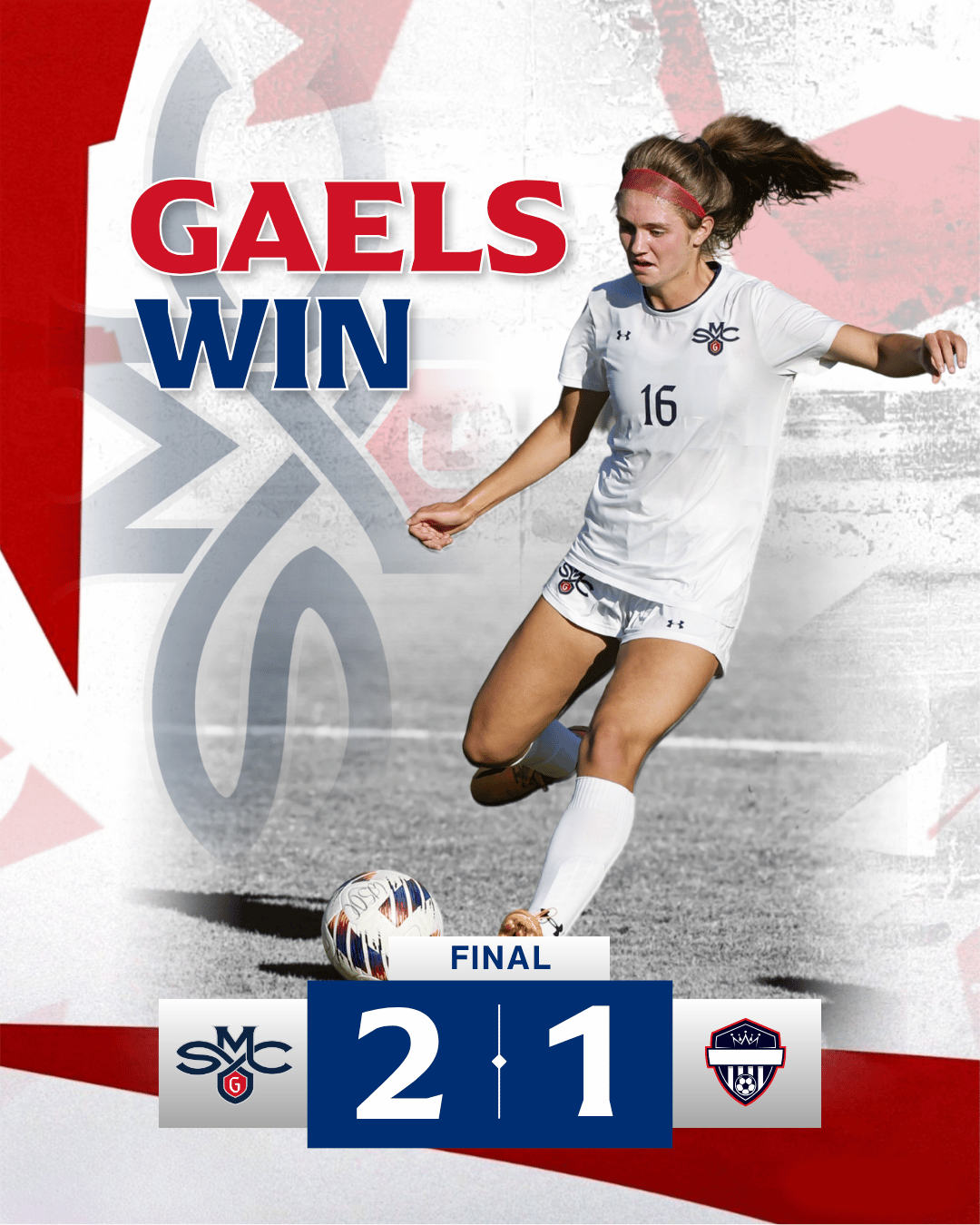
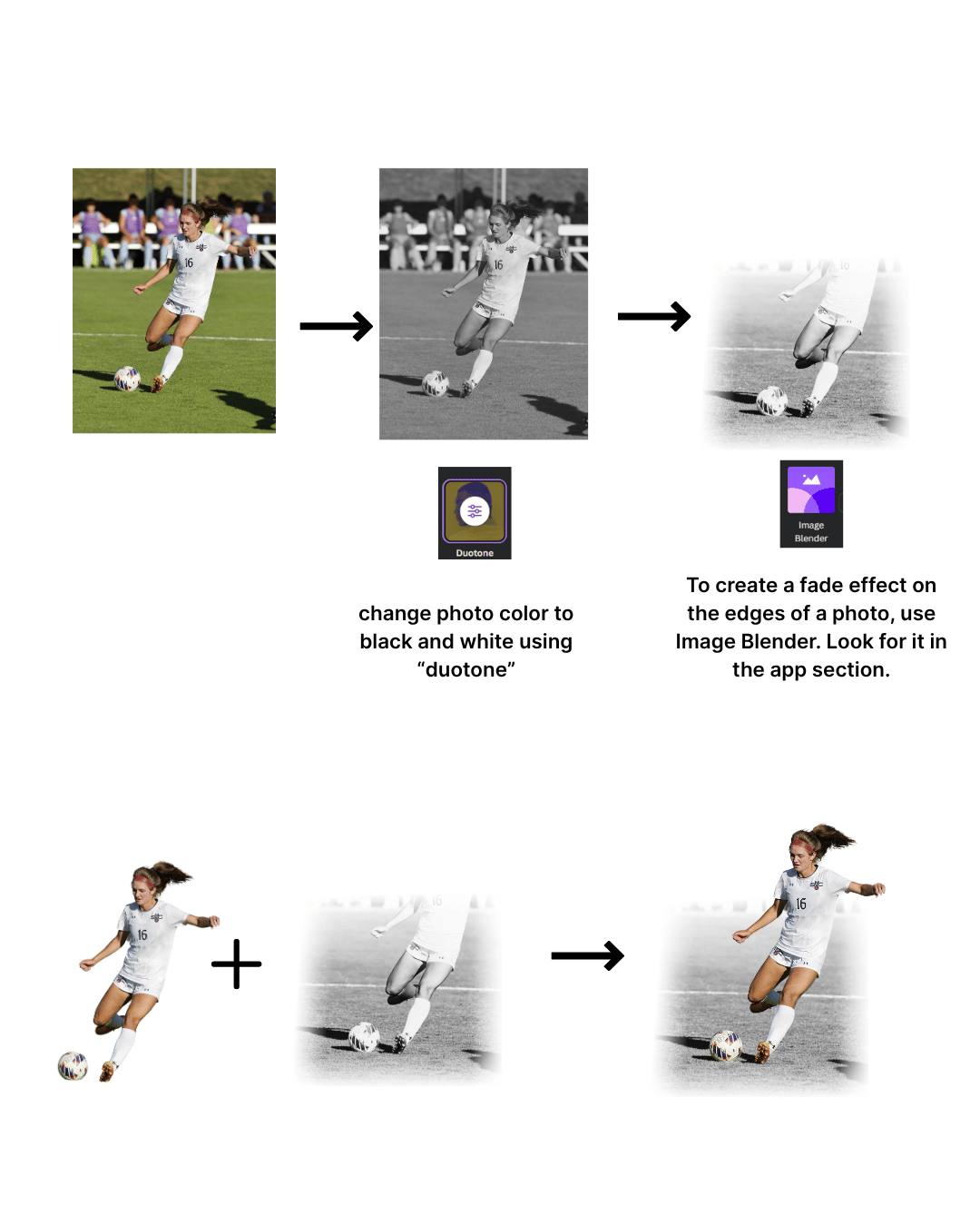
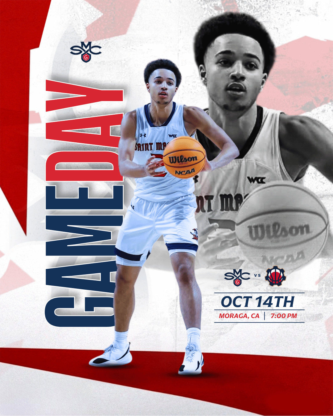
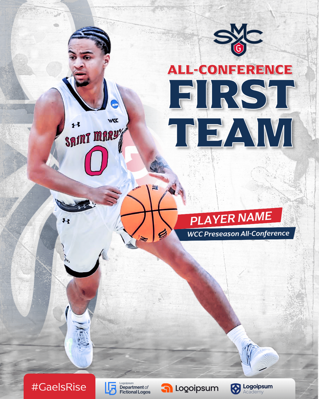
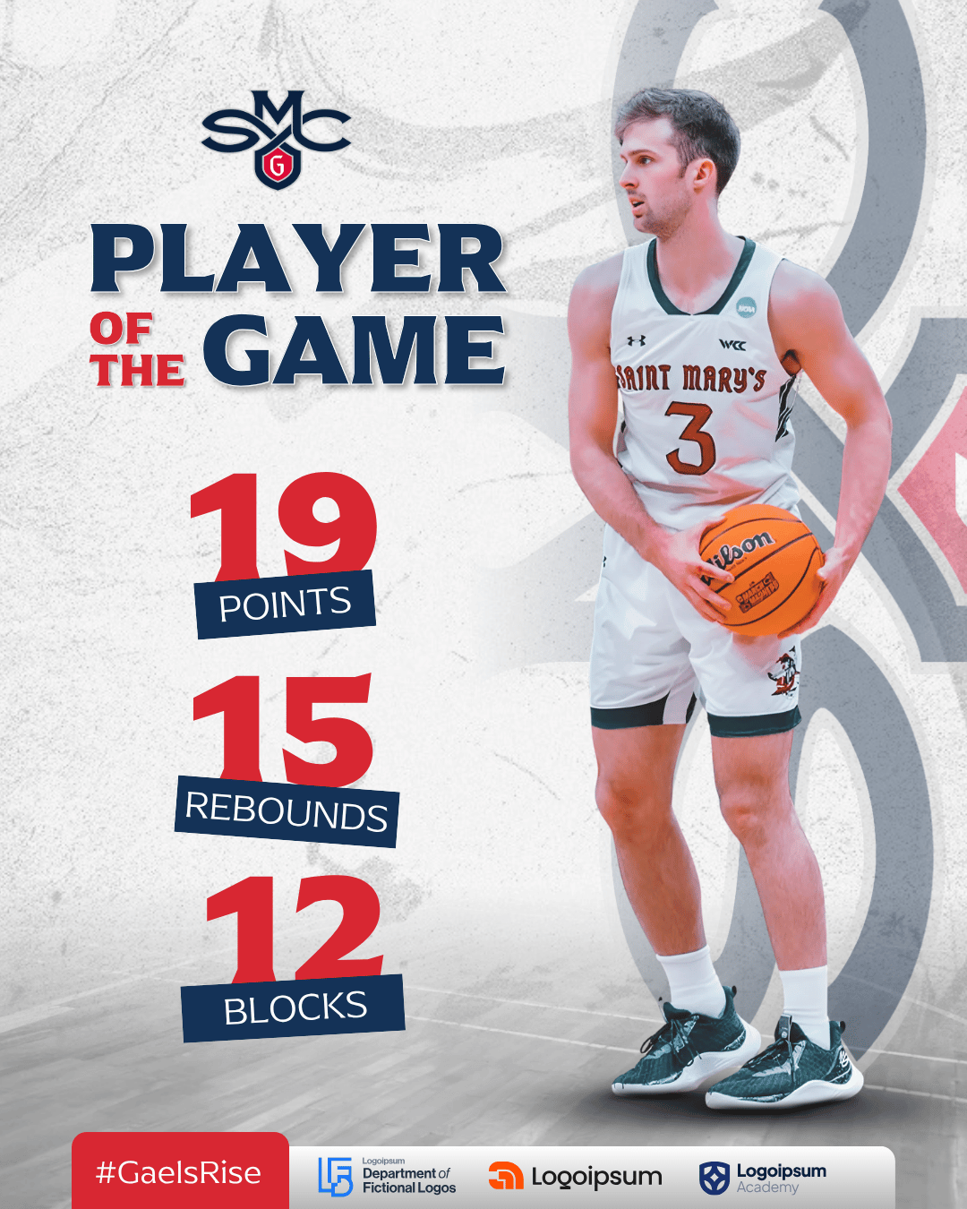
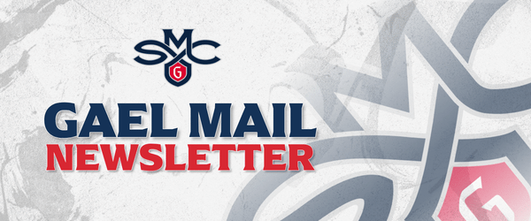
A shared visual language gives recurring communication enough flexibility to stay fresh while still feeling unmistakably connected.
Scope changes by project, but these are the building blocks we pull from when creating an identity that has to work in the real world.
Primary marks, secondary marks, icons, lockups, and variations built for different formats and environments.
A defined palette and type system that gives everyday communication an immediate visual foundation.
Practical guidance and reusable tools that help staff, volunteers, and partners keep the identity coherent.
Social graphics, presentation systems, print pieces, event materials, digital assets, and other places the identity needs to live.