
Clarify
Make the message easier to understand.
We organize your message, structure the visitor journey, and build a digital experience that helps people understand who you are, trust what they see, and know what to do next.

Clear story. Strong structure. A digital experience built around what people need next.
Pretty isn't enough. The site has to help the organization communicate and help the visitor move.
Make the message easier to understand.
Put the right information in the right order.
Create a digital presence that feels credible and current.
Make the next action obvious instead of buried.
Before a page gets polished, we work through who the site is for, what they need to understand, and what needs to happen next.
Goals, audience, current pain points, content, and the actions that matter most.
Navigation, page hierarchy, content priorities, and clear next steps before visual design begins.
Responsive layouts, visual hierarchy, brand expression, and interactions designed around clarity.
Development, testing, launch, training, and a handoff your team can actually maintain.
Scope changes by project, but these are the building blocks we use to move from scattered information to a coherent website.
Goals, audience, conversion priorities, platform needs, and what the site must accomplish.
Navigation, page structure, content hierarchy, and a visitor path that makes sense.
A polished visual experience across desktop, tablet, and mobile—not a desktop site squeezed smaller.
Flexible builds designed around maintainability, content updates, and long-term ownership.
Help shaping, simplifying, and arranging the content so the message lands clearly.
Practical training and documentation so your team knows how to keep the site current.
A self-initiated redesign concept exploring how the church's existing content could become a clearer, warmer, visitor-first digital experience.
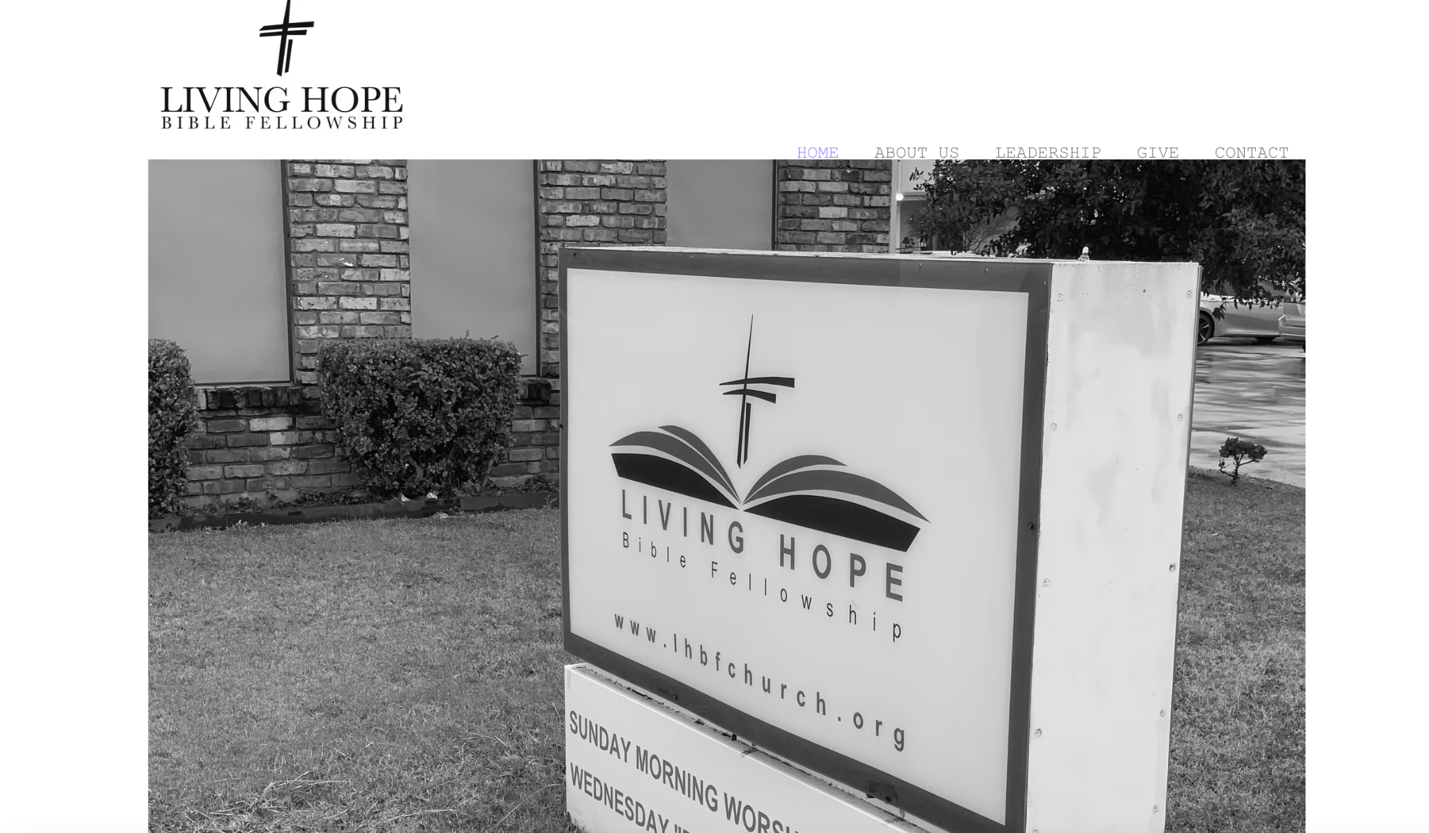
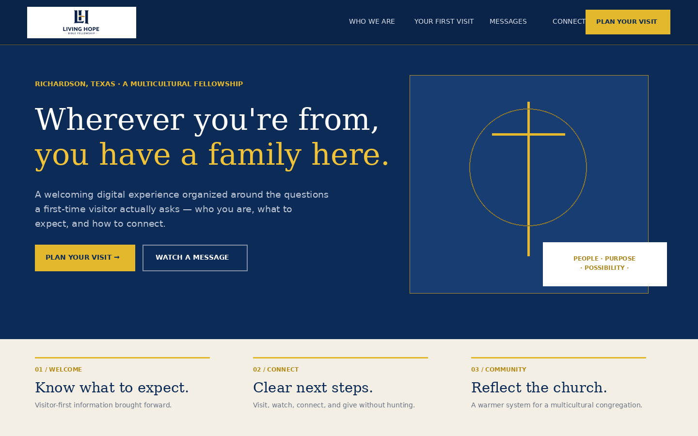
Drag the divider to compare the current experience with the CNL redesign direction.
The existing experience contains useful content, but visual hierarchy and navigation make it harder for a first-time visitor to know where to begin.
Who are you? What should I expect? Is there a place for me? How do I connect? The redesign brings those answers forward.
A more modern visual system, simplified pathways, stronger calls to action, and a mobile-friendly experience that reflects the congregation.
For churches, nonprofits, and lean teams, maintainability matters. We build with the handoff in mind—not just launch day.